Refreshing Retreat at Bay Cedar
After
Opening Your Space
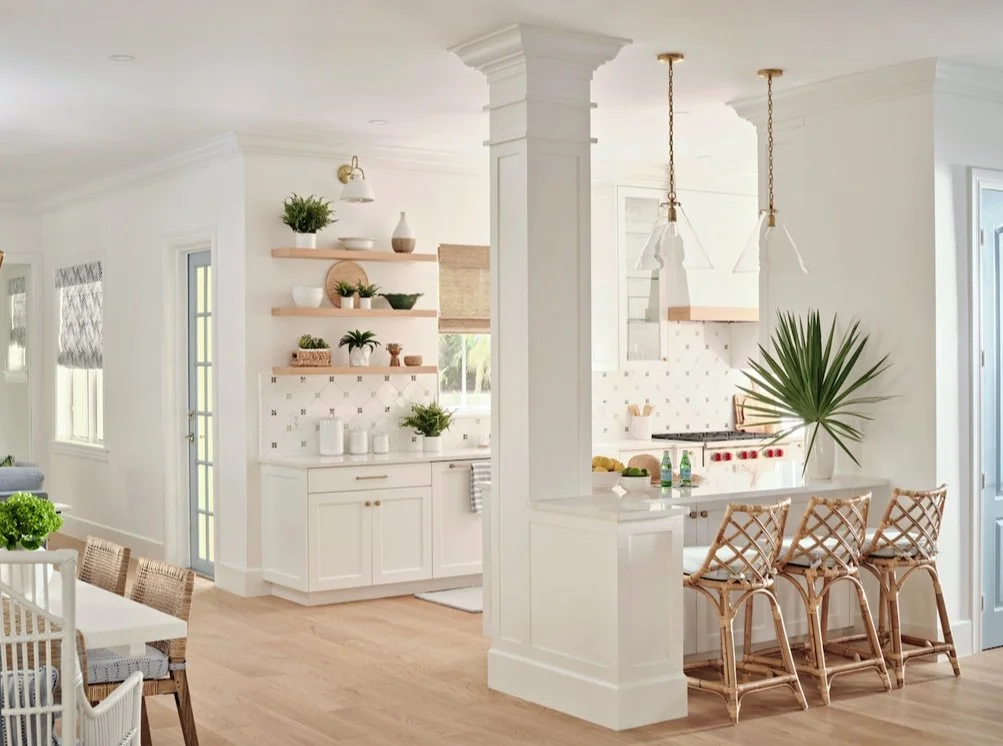
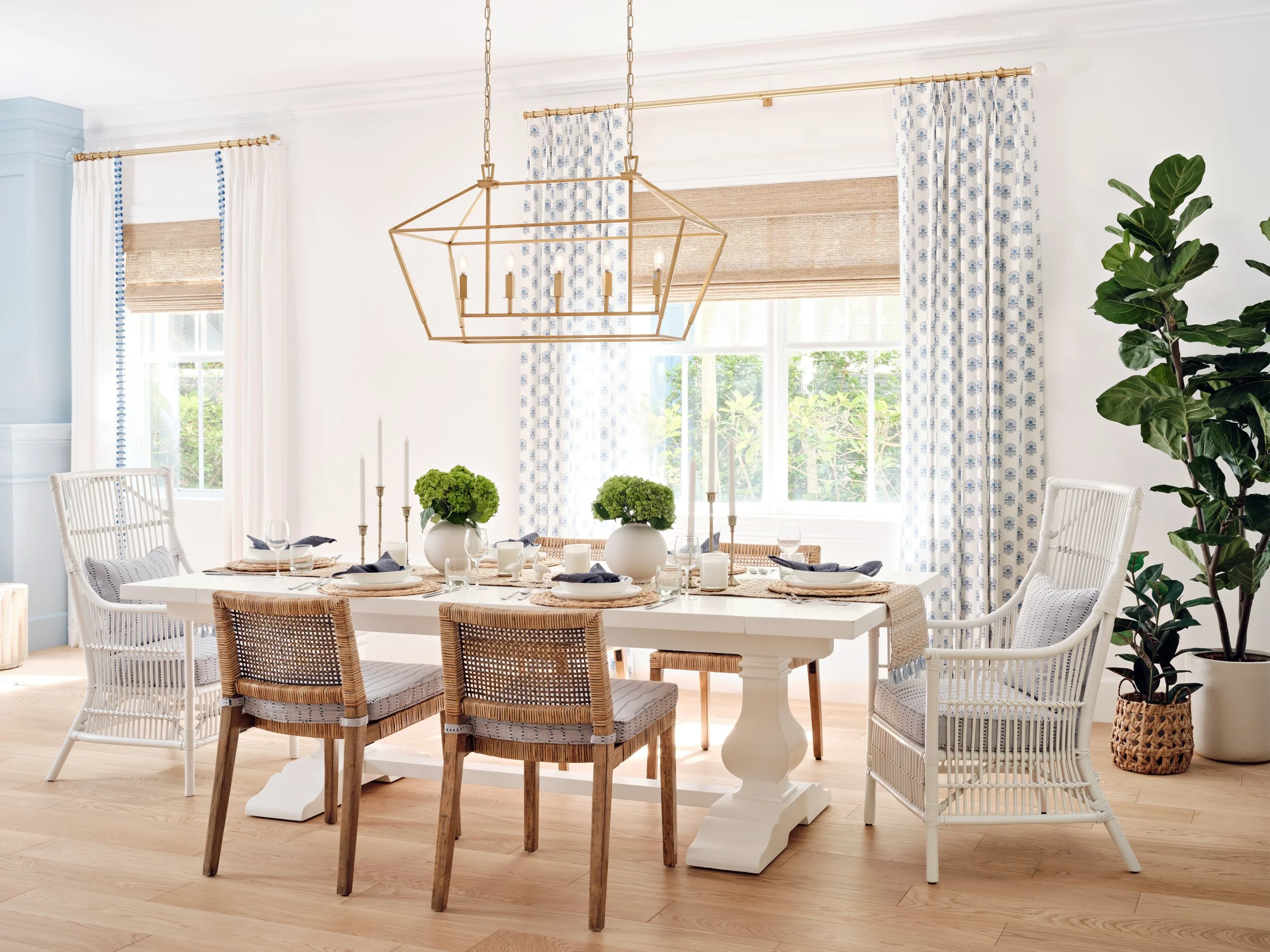
As an interior designer, one of the first steps in each project is evaluating the space. Our focus was to maximize the functionality of the space and create a welcoming environment. Initially, this kitchen and dining room were closed off from the main seating areas. When you walked in, you immediately noticed the wall obstructing the view between these spaces. Another challenge was the narrow-shaped kitchen layout, which was great for ample counter and storage space but made such a large area seem very confined.
Before
We knew we wanted it to be light and airy to transform this space. However, opening a space does not have to involve removing its admirable qualities. To create more flow in the kitchen, some of the walls had to go! The right kitchen wall backed up to a coat closet, so we removed that wall to open up the space. When we removed the closet, we knew there would be a column, but we were surprised to find some plumbing that we could not relocate. We created a knee wall around it, and we think it came out beautifully! Taking out a portion of the wall immediately made the space more breathable and allowed for additional dining space. This was an amazing solution to keep counter space while increasing functionality in the kitchen.
After
Benefits of an Open Layout
Open concept living brings multiple rooms together. By connecting all the rooms in one area, the space will appear much larger. Having an open floor plan provides clear walkways and a smooth flow from room to room. Another appreciable benefit of an open floor plan is that natural light fills your space with ease. The addition of natural light makes the area feel bigger, brighter, and more spacious. One more advantage of an open living concept is enhanced socialization within your space. By removing unnecessary walls, friends and family can comfortably interact with one another.
Working with What You Have
For the living room, we saw the potential in the existing architectural elements. We thought a great way to bring this room together was with a fireplace. The fireplace created warmth, anchored the space, and made for a cozy environment. To draw more attention to the fireplace, we added a new mantle, beautiful stone, and board and batten. Adding molding, paint, and new hardware was crucial in elevating this space.
Before
After
Bathroom Remodel
To maintain the stunning coastal theme, the bathroom needed a transformation. Initially, the bathroom had beige walls, which made the space feel much warmer. However, with such a small space, having such dark paint made the room appear more closed off and smaller to the eye. After a nice coat of white paint, the bathroom already felt more spacious! When you think of coastal, you think of blue. To bring in that beachy feel, we created a rectangle with blue penny tile. To further incorporate those blue tones, we added Roman shades with a sand dollar-like pattern.
Before
After
Foyer Redo
The foyer in a home is almost like a first impression, as it is the first space the eye meets when you walk in. Our goal was to make the entrance to the home inviting. As you walk into this home, you immediately see the stairs. Originally, the tread and railing of the stairs were wood-stained. To brighten this space, we painted the tread white and the railing a beautiful soft blue.
Before
After
Serene Study
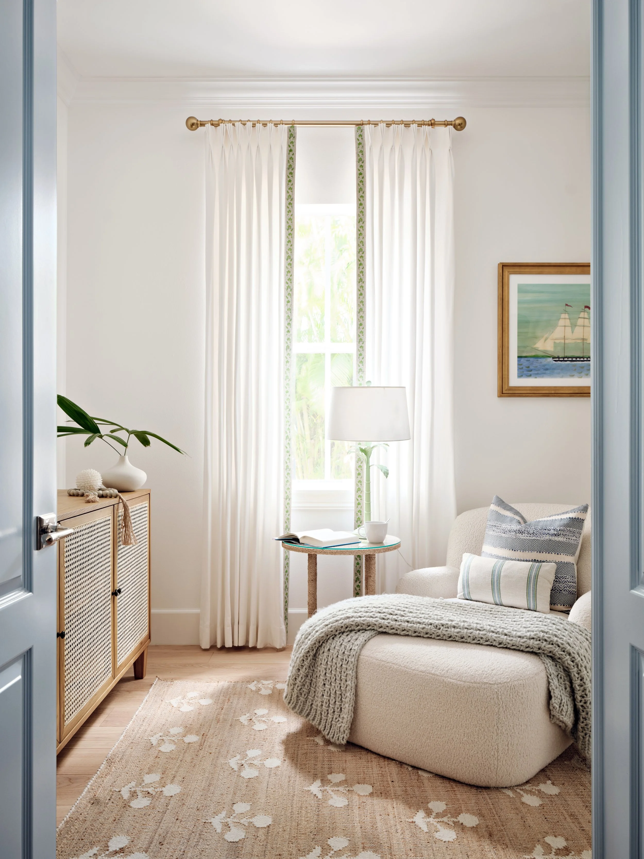
A study is a room used for paperwork, computer work, and a relaxing place to read. Before we revamped it, the room was very dark with a lot of wood tones. Considering the uses of a study room, this particular room needed lots of light. One way to lighten up the space was to change the flooring. Throughout the entire house, the flooring was a dark cherry wood. Changing it to light oak really brought life back into the house. In addition to changing the floors, a coat of white paint did wonders. We also added a comfortable chair to sit and read in. This room is now inviting and has become a perfect atmosphere for relaxation!
Before
After
Lavish Laundry
One feature to really love about this house is the ample space and storage in the laundry room. We wanted to preserve that space so our clients could seamlessly accomplish their everyday tasks while maintaining the aesthetic throughout the home. A functional must-have was deep countertops. Deep countertops are incredibly helpful when folding and sorting clothes. An aesthetic fundamental was to paint the cabinets and the walls. We chose to paint the cabinets blue to give the space a refreshing feel against the white walls. The hints of blue in the cabinets and window treatments complement the stunning hexagon tile chosen for the floor.
Before
After


