Namaste
Before and After's are so much fun. To look at a finished product is exciting, but to see where it came from makes it that much better.
This was one of my all time favorite projects as an interior designer. I was hired to help out with some office furniture for a friend's husband and it turned out to be so much more.
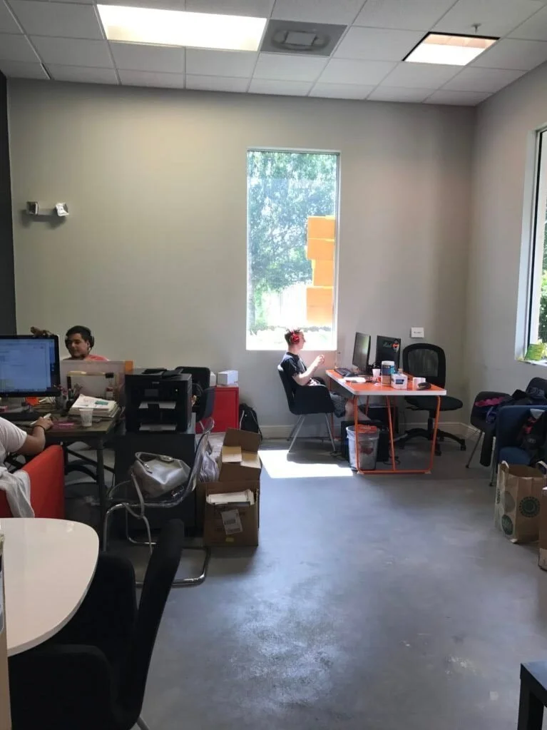
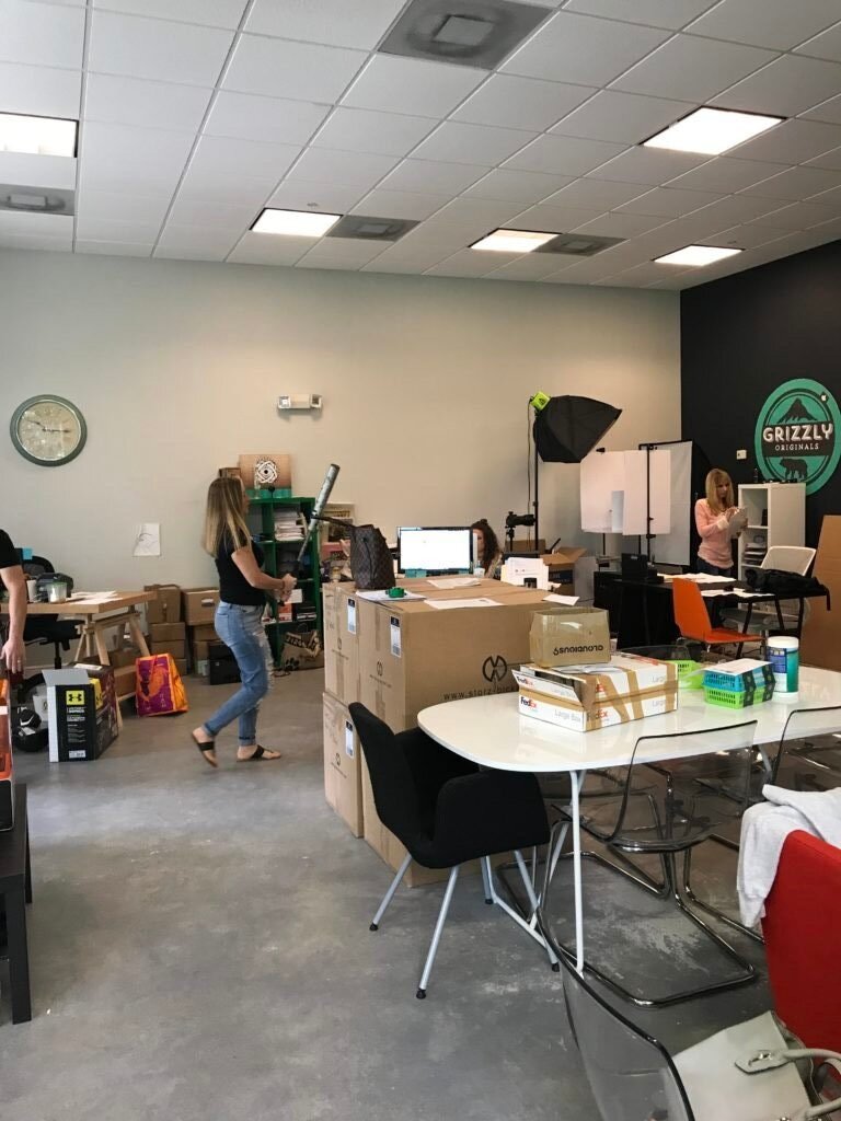
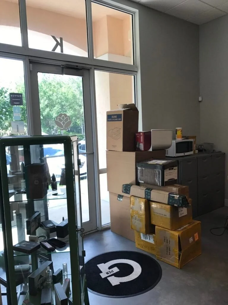
This company was growing fast and I stepped in right in the middle of it. What started out as a warehouse full of merchandise and a small cluttered area for staff, turned into a working functioning headquarters.
This "before" photo is what became the CEO's office. He needed a closed environment where he can have privacy to speak on the phone and video chat, but also wanted it to be light and airy. We first stained the concrete floors black and gave the walls a fresh coat of paint. The floor to ceiling glass wall was next, some window shades for the sun, a gorgeous chandelier and some comfortable and functional furniture.
"BEFORE" PRIVATE OFFICE
Outside of this office we needed work space for 3 employees. I had the idea to make a feature wall as the first thing you see as you enter. I developed a design concept and found a recommended artist to do the job. He did it free handed in two days, he was amazing, a true talent.
“BEFORE”
“AFTER”
In front of this desk area is a nice spot with a lot of light that I made as a lounge area for additional work space and seating.
"BEFORE"
“AFTER“
The client gave me creative control which was amazing. He trusted me and let me take the lead. Since they were growing so fast things were changing daily. The back warehouse section with merchandise was moved to another facility so we had all that space to work with.
They wanted a kitchen, lounge area and desks for employees. More than that, they wanted a fun, laid back, exciting environment for their investors and staff from around the world to be able to work and enjoy.
“BEFORE” WAREHOUSE
“AFTER” WAREHOUSE
It was very difficult to photograph the "before" because the space was so packed with inventory, I had to see beyond that! We painted the entire space white to make it bright since there is only one window. We stained the floor black and added astro turf. I wanted the space to feel like you are at an outdoor park. I had custom made swings made with the client's name and year established engraved on each one. The same artist who did the front wall did the client's tag line on this wall as well.
There was no kitchen. They had a slop sink, a fridge and some shelves for supplies.
“BEFORE KITCHEN”
“AFTER KITCHEN”
We added a wall with a new fridge, a kambucha machine, large sink, dishwasher and shelf for dishes and glasses. The island housed a beverage center, microwave, coffee machine, pullout trash and storage. This island created additional seating/work space for employees and guests. We added some hanging pendants and lights above the shelves.
We needed to create a work space for the 10 employees who are working the phones everyday. We went with a long communal style desk with glass privacy screens.
“BEFORE”
“AFTER”
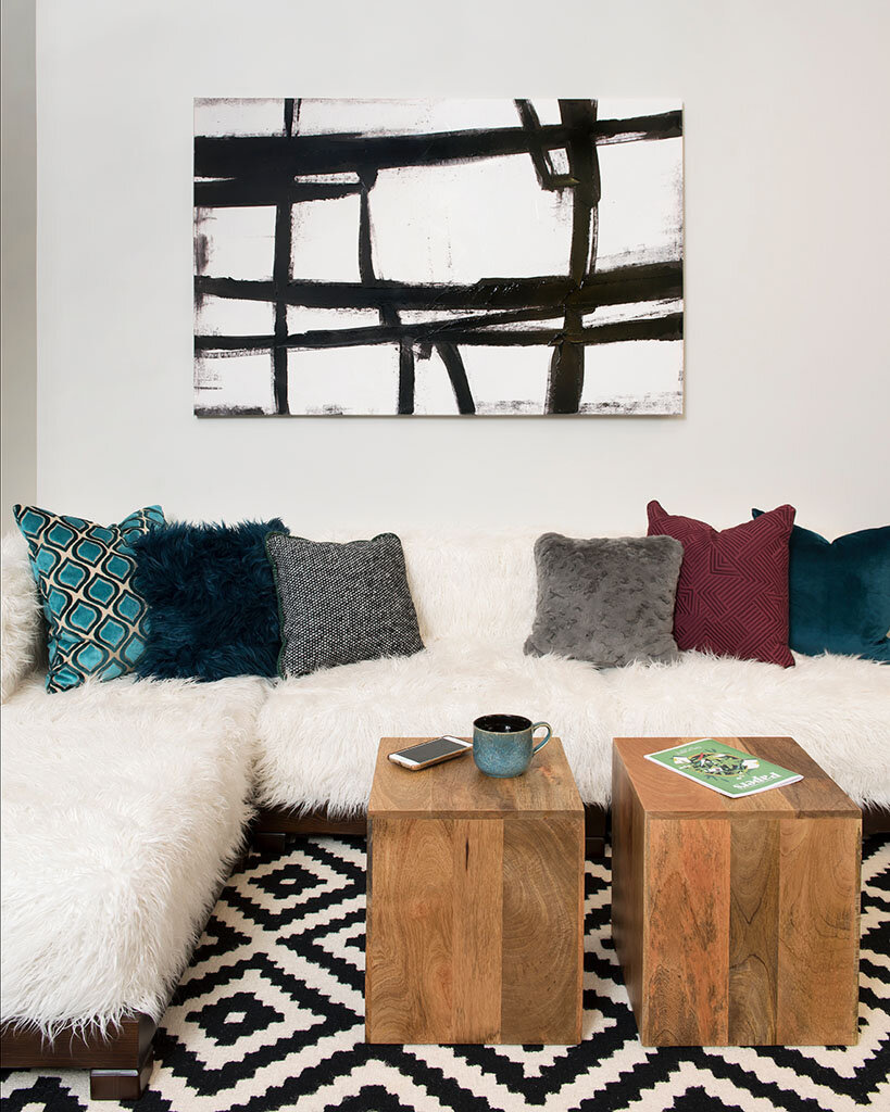
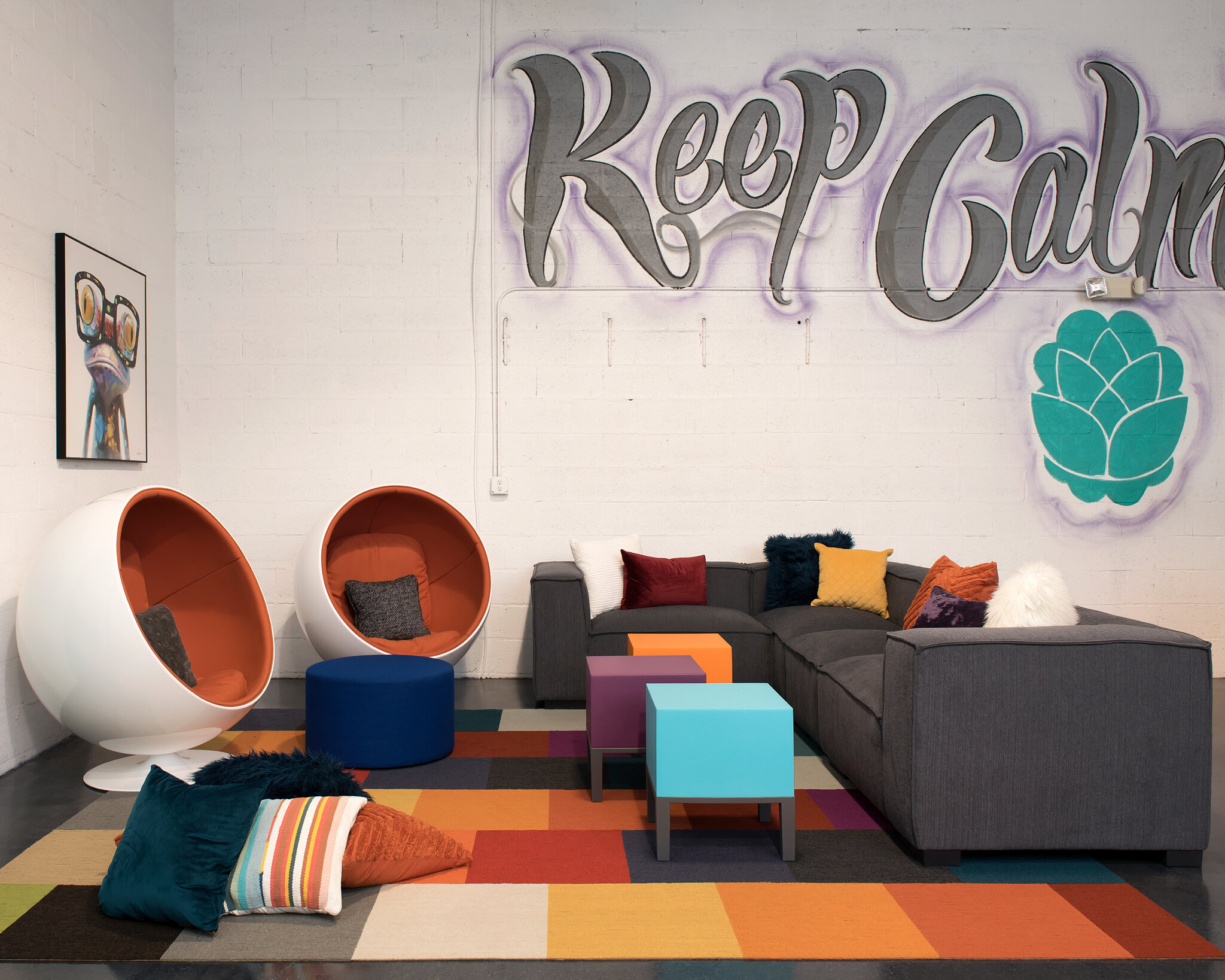
The last section is a living room area where people can relax, work on their laptops or make calls with their headsets. I found the cool round chairs at Market and knew immediately I had to have them. There is no "BEFORE" photo of this area.
The bathroom was in pretty bad shape so we added some wallpaper, put down a new floor and re - accessorized.
“BEFORE”
“AFTER”
I have to say I am sad that this project is over. I loved the people and being in such a fun cool environment everyday.
I hope you enjoyed my little tour. Let me know in the comment section what your favorite part was!
XOXO
Jennifer


